Museums are benefitting from the decline of long-form print journalism according to Design Museum director Deyan Sudjic, who spoke to Dezeen's Marcus Fairs in this talk we filmed for Molteni&C. Read more
Wednesday, October 19, 2016
Wednesday, October 12, 2016
Which Late-Night TV Host Is Better at Trump Takedowns?

Tuesday, October 11, 2016
Samsung pulls Galaxy Note 7 phone from production
Saturday, October 8, 2016
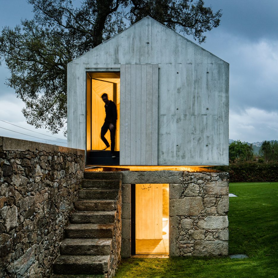
Concrete dovecote transformed into children's playhouse by AZO Sequeira
A small concrete structure once used as a house for doves has been transformed by Portuguese studio AZO Sequeira Arquitectos Associados into a garden playroom. (more…)
Friday, October 7, 2016
Can Spicy Foods Really Cool You Down?

Citroën Origins
Thursday, October 6, 2016
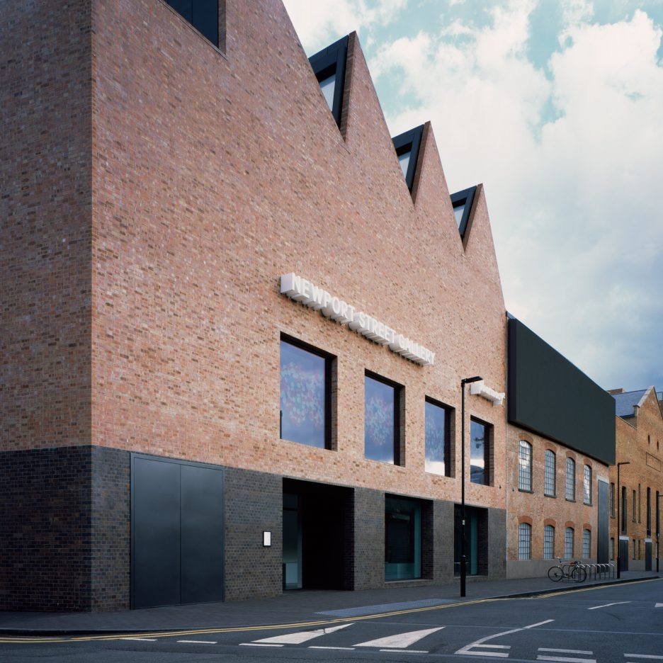
Caruso St John wins Stirling Prize 2016 for Damien Hirst's Newport Street Gallery
Caruso St John Architects has won the RIBA Stirling Prize 2016 with the "highly accomplished and expertly detailed" London gallery it designed for British artist Damien Hirst (+ slideshow). (more…)
Vancouver architect Bing Thom dies aged 75
Wednesday, October 5, 2016
Typographic Trickery Shifts a Font from Paper to Pixels

Thursday, September 29, 2016
Senscommon designs unisex raincoat for cyclists with split hem to keep legs dry
Monday, September 26, 2016
After 5 Decades, Colombia And Rebel Group FARC To Sign Peace Treaty
The Colombian government and FARC guerrillas on Monday will sign a pact that could end a war that has killed more than 200,000 people. The treaty still will need support through a public referendum.
Friday, September 23, 2016
Candidates Want To Raise The Economic Tide To Lift Opportunity, But How?
Both Hillary Clinton and Donald Trump talk about increasing opportunities for coming generations. Some analysts say boosting economic growth would help, but the way there is complicated.
Wednesday, September 7, 2016
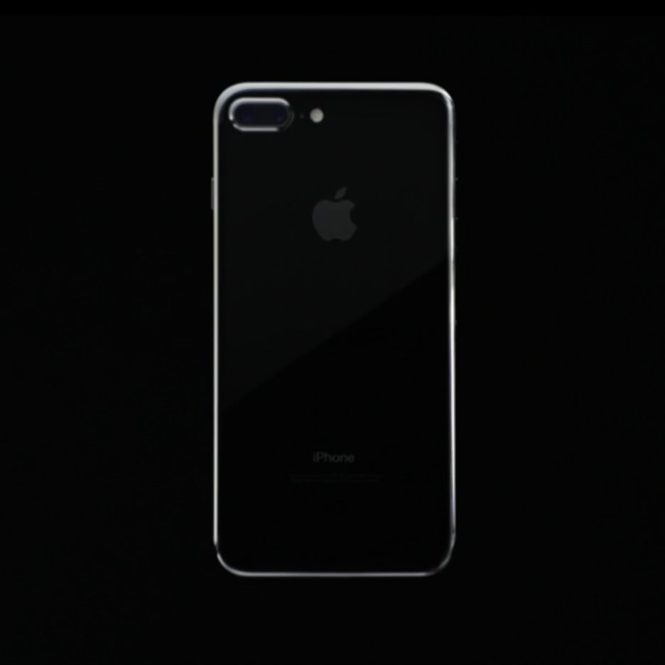
Apple unveils iPhone 7 at 2016 Keynote event
Monday, September 5, 2016
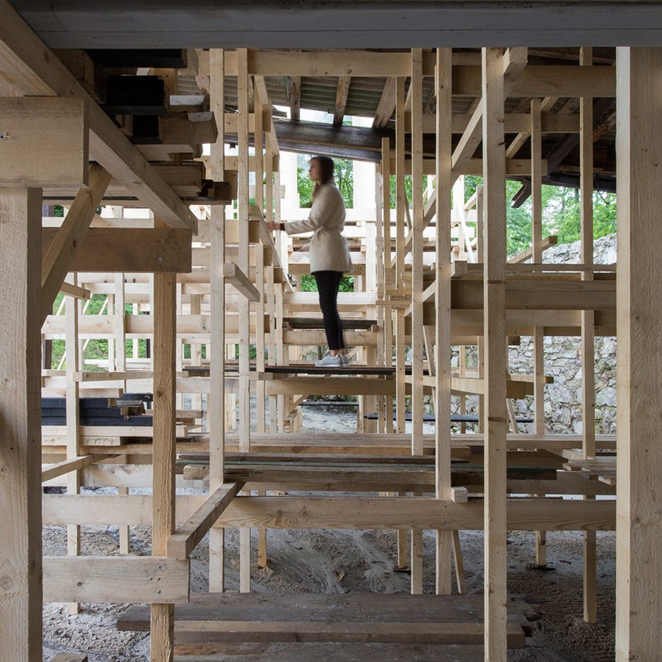
Students build scaffold-like pavilion topped with mesh "cloud" at former Latvian brewery
Tuesday, August 30, 2016
President Barack Obama Will Guest-Edit WIRED's November Issue
Saturday, August 27, 2016
Friday, August 26, 2016
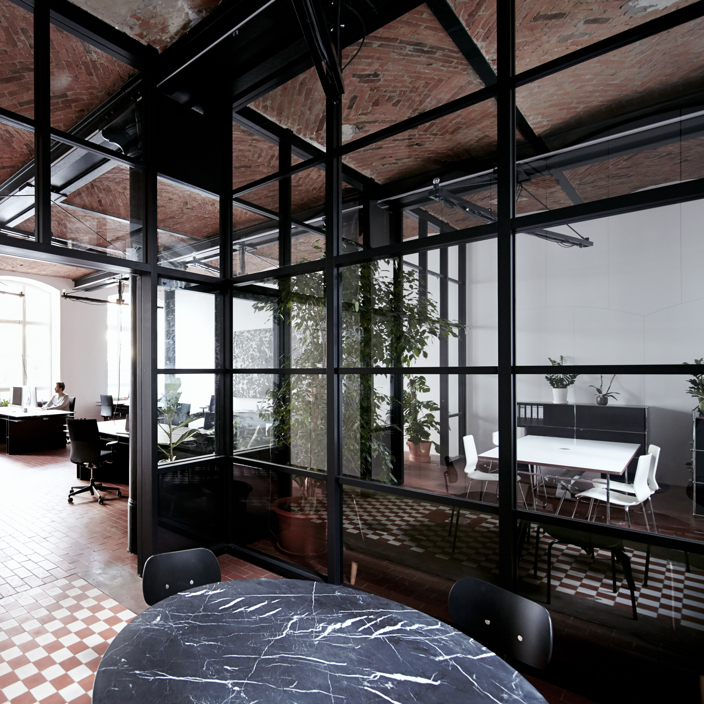
IFUB transforms former chocolate factory into office with secret storage
Wednesday, August 24, 2016
Google moves to restrict advertising
Do you hate it when ads straight up block access to the content you want to see? Well Google does too! No, really. Starting now, Google will be penalizing sites that use interstitial ads on mobile devices.
Why aren't they doing this on desktop devices? I assume this is our punishment for not all switching to Chrome OS already.
But seriously, this is good news for users, and it's going to annoy a lot of advertisers. Google is specifically targeting interstitial ads that need to be dismissed before you can see or interact with the rest of the site. So we're talking about page redirection ads, those annoying modal windows that pop up when you load the page, those annoying modal windows that pop up in the middle of an article, and so on.
Not only can they be annoying to see, they can be annoying to get rid of. They often make the little “X” icons so small, and it's too easy to accidentally tap on the ad instead of dismissing it.
Now, Google seems to be okay with very small interstitial ads. Think of those tiny floating banners that show up at the bottom of your phone's screen sometimes. Those are apparently ok. So are popups that are used for legal reasons, like verifying someone's age [and here, the author snorted in amusement], or telling them that the website uses cookies [and here, the author felt hungry].
So, good news for everyone except evil advertisers, right?
So, good news for everyone except evil advertisers, right? Well, here's something to consider: in many ways, Google is becoming the arbiter of good design, at least when it comes to ads.
Once upon a time, their rules were all about preventing people from using unethical SEO “hacks” that allowed them to dominate the rankings for their search terms, and even for terms that had nothing to do with what they were selling. That was, and still is a good thing. Not only do these rules more or less keep things fair, they actually simplify the process of SEO.
Recently, though, Google has begun to punish people for doing stuff with ads that is definitely irritating, and probably counterproductive, but not specifically morally or ethically wrong. Do we really want Google defining what a good design is? On the one hand, I've often joked about embracing our new Googly Overlords with open arms. You could definitely see this as Google just lending the users a helping hand. We've been saying for a long time that interstitial ads are not great, and many have yet to listen.
With this update, Google is going to make them listen.
On the other hand, Google is a corporation. I'm pretty sure the three-hundred-and-sixty-seventh rule of aquisi… I mean… capitalism… is that corporations are not your friend. Now, they probably won't penalize sites that aren't built with Material Design, or anything like that, but we do have to wonder how far they will go.
At least we should be asked to sign up for fewer newsletters three seconds after loading a page.
Master WordPress, Drupal, Joomla, Coding and SEO with 2900+ OSTraining Video Courses – only $44! |
Source
In Maine, Land From Burt's Bees Co-Founder Is Declared A National Monument
Roxanne Quimby donated nearly 88,000 acres of land - once used to harvest timber for paper mills - to the federal government. Now it's the Katahdin Woods and Waters National Monument.
Tuesday, August 23, 2016
You Can Now Browse Harvard's Huge Bauhaus Collection Online

Monday, August 22, 2016
Cornwall Gardens is a huge Singapore home with a stepped garden on its roof
A+Awards: featuring a swimming pool, waterfall, Koi carp pond and a terraced roof garden, this large family home in Singapore was another of the winners in Architizer's 2016 A+Awards (+ slideshow). (more…)
Friday, August 19, 2016
What Makes A Jam A Jam? Surge In Savory Spreads Presents Riddles For Purists
Savory jams tap into a love affair with foods that marry salt and sugar. They let people eat local fruits and vegetables year-round and lower the sugar levels found in traditional jams.
Tuesday, August 16, 2016
This Bot Tweets a Totally Fantastical Map Every Hour
Saturday, August 13, 2016
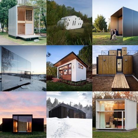
Prefabricated houses pack out Dezeen's latest Pinterest board
What if you could ship your house to anywhere in the world? Our latest Pinterest board is dedicated to houses that are built in a factory and assembled in far-flung locations, such as a remote Finnish island or a Brazilian mountain landscape.
Follow Dezeen on Pinterest | See more prefabricated buildings in our archive
Wednesday, August 10, 2016
After Damning Assessment Of Police, Baltimore Mayor Says 'Long Journey Ahead'
The Department of Justice found that the city's police force engaged in a pattern or practice of discrimination. Mayor Stephanie Rawlings-Blake says she won't sugarcoat the problem.
Zooming Background Images
The following is a guest post by Dylann Winn-Brown, who shows us a performant way to accomplish this design effect.
Whilst working on a client's website recently, I was asked to replicate an effect like this.

This type of effect is notably used in portfolio-type situations where the design intends to show both visual and informational details.
There are many different possible methods
As I had never created an effect like this before, I began to take a look at different ways of doing this and came across a number of different methods.
One option was to use a jQuery Plugin. This one wasn't quite the effect I was after, and certainly not very lightweight.
Another option was to position an srcset so that the image used is performance and device-appropriate.
In my situation, I wanted to manage the effect entirely in CSS, so I went for that.
Basic functionality
In order to achieve optimal performance, I decided to use the CSS transform property to handle the enlargement of the image. (CSS animations benefit from hardware acceleration and as a result appear smoother than other methods of animating.)
Rather than an First we specify the dimensions for the parent element. Then the child can fill the parent using We then add hover effects to our parent element which will affect our child element. A focus style is good for accessibility as well: You may want to use a tool for adding prefixes for the best possible browser support. To finish up the basic effect, we can add some transitions to our child element's normal state: If you want to add a color overlay, you can make use of pseudo elements like Now when we hover on the parent element, the child element should show a color overlay! Finally, we'll cover how to add some text to show on our overlay. We can add an element to our current child element like so: We can give our and we can make it visible only when we hover on the See the Pen Image zoom on hover - portfolio websites by Dylan (@dwinnbrown) on CodePen. If the containers are links and the hover states don't reveal any essential information, you might just leave it alone. If the hover states are important, in order for this to work on touch screens, we can use empty Zooming Background Images is a post from CSS-Tricks
width: 100% and height: 100%;, as well as set the background image, ensuring it scales to cover the area.
.parent {
width: 400px;
height: 300px;
}
.child {
width: 100%;
height: 100%;
background-color: black; /* fallback color */
background-image: url("images/city.jpg");
background-position: center;
background-size: cover;
}
.parent:hover .child,
.parent:focus .child {
transform: scale(1.2);
}
transition: all .5s;
::before:
.child::before {
content: "";
display: none;
height: 100%;
width: 100%;
position: absolute;
top: 0;
left: 0;
background-color: rgba(52, 73, 94, 0.75);
}
.parent:hover .child:before,
.parent:focus .child:before {
display: block;
}
Hello
some style:
span {
color: white; /* Good thing we set a fallback color! */
font-family: sans-serif;
padding: 25%;
position: absolute;
}
.parent:
.parent:hover span,
.parent:focus span {
display: block;
}
Live Demo
Mobile Support
onclick="" handlers on our .parent containers. Unfortunately I couldn't come across another way of doing this but if any of you do, let me know in the comments!
Sunday, August 7, 2016
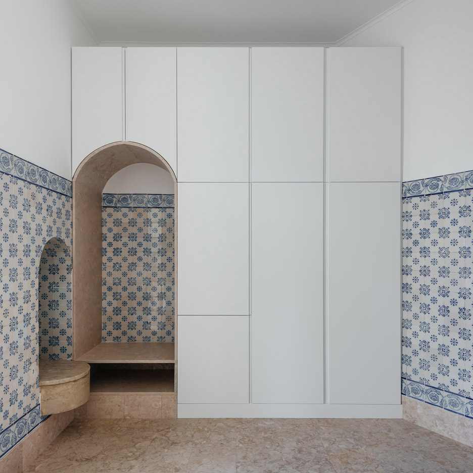
Aurora Arquitectos draws attention to additions and "ruptures" in Lisbon apartment
Wednesday, August 3, 2016
Facebook Explores New Hardware Inside 'Area 404'
Sunday, July 31, 2016
Afsharian's House by ReNa Design has a huge vertical slice in its facade
Friday, July 29, 2016
Melania Trump's website deleted after architecture degree claim debunked
The website of Melania Trump, wife of Republican US presidential candidate Donald Trump, has been taken down after it emerged that the claim she obtained a degree in architecture was false. (more…)
Friday, July 22, 2016
"The idea of succession is not discussed enough in the design industry"
Opinion: designers need to stop thinking about business as a dirty word and consider the legacy of their company, says Paul Priestman, chairman of transport design firm PriestmanGoode. Here, he explains why he has effectively sold his company to his employees. (more…)


